Viewing Your Public Cloud Billing Reports
Viewing Your Public Cloud Billing Reports
#380550
The Densify Cloud Cost Intelligence module allows you to review your billing data through a dedicated reporting interface. It is a full-featured reporting framework that allows you to filter and build the reports you need to manage your cloud bills. You can customize and save your reports and then generate them monthly or as required, for analysis.
Note: Note: Collection and analysis of billing data is only supported for AWS and Azure.
Prerequisites
The following prerequisites must be addressed before you can access the Cloud Cost Intelligence module:
- Configure and initiate data collection—You must create a cloud connection and collect both utilization and billing data. It may take up to 24-hours from the time you create the connection to data being collected and loaded into your Densify instance.
- See
- See
- Join the Billing_Analyst group—Your Densify user account must be a member of the Billing_Analyst group. Once the module has been enabled, Densify will either create a new billing analyst user account or add your existing account to the Billing_Analyst group. See
The Densify Console has been optimized for Google Chrome so this browser is highly recommended for the richest user experience.
Accessing the Cloud Cost Intelligence Module
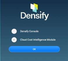
- Log in to Densify using your Billing_Analyst user account.
- You will be prompted to select which console to open. Select Cloud Cost Intelligence module.
- When you log out of the Cloud Cost Intelligence module, you are returned to the Densify login page. You need to login in and select the Densify Console to access other Densify features.
Cloud Cost Intelligence Menus
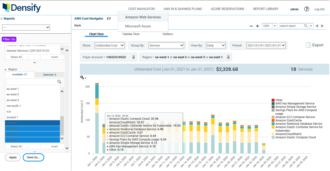
The Cost Navigator is displayed by default. You can review your AWS or your Azure billing data by selecting the desired option from the Cost Navigator menu. Menu options are displayed based on the billing data that has been collected.
Reserved instances, Savings Plans and their corresponding reports are available in the AWS RI and Savings Plans menu:
- If you collecting both AWS and Azure billing data , you will see both menus.
- If you are collecting AWS or Azure billing data only the corresponding menu is displayed.
See the following topics for AWS RI, AWS Savings Plans and Azure reservation-specific reports:
The data displayed in each report is based on both the selected grouping options at the top and the filters located on the left side of the page. See
The Report Library menu at the top of page is intended for future development. Depending on your specific installation you may see the list of your Cloud Cost Intelligence reports, including any custom billing reports that have been enabled. Contact [email protected] for details of your custom reports.
All other custom reports are available through Densify Console > My Reports. See
Cost Navigator Overview
Once the billing data has been collected by Densify, the following tabs provide the tools to review your AWS or Azure bill:
- Chart View—Provides a chart summary of your AWS or Azure billing data.
- Tabular View—Provides a tabular summary of the entire data set for AWS or Azure.
- Outliers—Provides a table of billing anomalies for AWS or Azure.
AWS or Azure are presented in separate reports, as selected from the Cost Navigator drop down menu. The billing data is not aggregated.
You can customize and save a set of options for any of these reports, that you can then access at any time, through the Reports drop down menu.
Other parts of Cloud Cost Intelligence interface allow you interact with the reports, by allowing you to filter the data, providing a summary of the filtered subset and indicating your filtering selections.
A summary bar is provided at the top of each of the Cost Navigator and AWS and Azure Reserved Instances reports that provides a high level overview of the report content. The content for the AWS and Azure summary bars are different and the totals are affected by the grouping and filter settings that have been applied to the report.
Note the following properties for each cloud provider:
Table: Attributes with the Same Definition in both Platforms
|
AWS Name |
Azure Name |
|
Linked Account |
Subscription |
|
API Operation |
Meter |
|
Usage Type |
Service Tier |
|
Service |
Resource Providers |
Table: Platform-Specifc Attributes
|
AWS Name |
Azure Name |
|
Payer Account |
Service |
|
Charge Frequency |
Breadcrumbs
The displayed billing data is based on the selected grouping and filtering options at the top and left side of the page. If filtering has been enabled, you will see the selected filter setting as "breadcrumbs" at the top of the report.
For some reports, you can disable a filter by clicking the x at the end of the item, from this bar.
See
Savings Plans
Savings plans offer discounts when you make an hourly commitment to compute usage and are automatically applied to any applicable compute usage across regions, regardless of instance size, tenancy, and OS. These discounts are reflected on the chart as negative values and are indicated in the chart's legend.
The type of chart view is selectable. The top 9 items, as defined by your grouping and filtering selections are displayed on this chart and are listed in legend on the right side of the page. The remaining items are grouped together and labeled as "Other" in the legend. You can open the Tabular view to see the details of all the services.
You can also hover over any one of the bars to see a breakdown of the data.
The type of chart is selectable and options are described below.
You can choose from various chart types to best suit your requirements. The chart type selection is not saved when your report options are saved.
Note: Note: This feature is not applicable to the Reserved Instance Utilization Report.
By default, the selected data is shown in a column chart format. You can select a different type of chart at any time from the Chart Types window. The following chart types are provided:
Table: Cloud Cost Navigator - Chart Type Options
|
Column Name |
Description |
|---|---|
|
Column |
Values are displayed as columns. Three report options are available:
|
|
Bar |
Values are displayed as bars. Three report options are available:
|
|
Line |
Values are displayed as points connected by lines. Two report options are available:
|
|
Area |
Values are displayed as shaded areas. Two report options are available:
|
|
Spider |
This type of chart displays three or more values on a series of spokes. Spider charts can use columns, lines, or areas to display values.
|
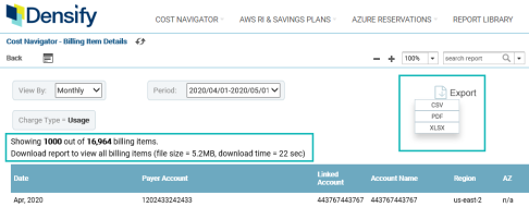
Though the charts show only the top 10 items, this tabular view provides details on the entire set of data, as defined by your grouping and filtering settings.
Note: Note: When working with the Azure Cost Navigator > Tabular view the available filtering options are not being applied. This a known issue and will be resolved in a future release.
Within the table, you can click on any of the entries with hyperlinks to see an expanded view of the underlying data from the cost and usage report. The billing line item details are a rolled up value and when you click to drill down the resulting data is capped at 1000 rows, so as to not impact performance. The message at the top of the table indicates how many additional rows of data are available
You can export the content from both the tabular view and the drilled down details report to see the full set of data. See Exporting Cloud Cost Reports , below for possible export limitations.
Specific column names and data reflect the cloud platform you are viewing. Columns for AWS accounts will be different than those collected and displayed for Azure subscriptions. For both Azure and AWS the user defined tags are those that have been mapped to Densify attributes. Contact [email protected] for details.
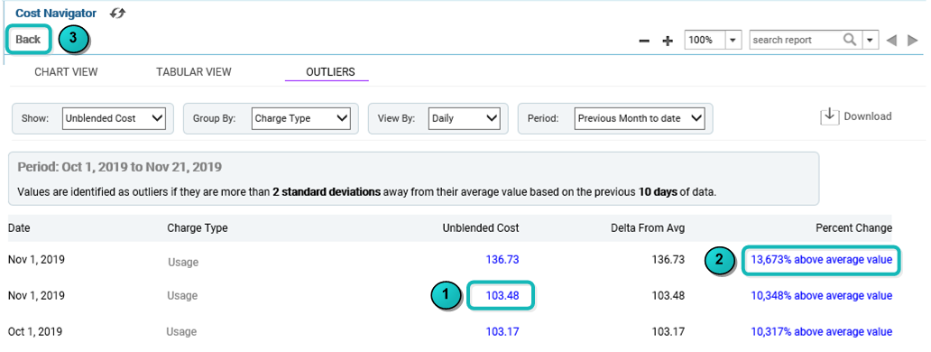
This report tab, within the Cloud Cost Intelligence console, provides a tabular list of values that are identified as outliers. Values are considered outliers if they are more than 2 standard deviations away from the average value. The average value is determined from the previous 10 days of data. The table is sorted by the highest outlier value.
The set of outlier data displayed, is based on the selected grouping and filters. If you change the settings, the new settings will also be applied to the cost navigator, so you may want to save your report configuration before making any changes. The outlier report is available for both AWS and Azure.
Links are provided within the outlier report that allow you to investigate the data.
- Click the first link to see the detailed data that has been rolled up to the outlier value.
- Click the second link to open a graphical representation of the outlier data. This chart provides the upper and lower limits of a moving average of your selected data, as a set of bands. The bands provide an area that includes 95% of your data. The range typically corresponds to 2 standard deviations above and below a 10-day moving average. These settings are configurable.
- Click the Back button (below the Cost Navigator label) to return to the parent report. If you drill down to the detailed or graphical outlier data report, click the Back button to return to the parent outlier listing.
You can select from various chart options. The most commonly used line chart is displayed, by default.
The outlier tabular report is sorted by the values in the column "Delta from Avg".
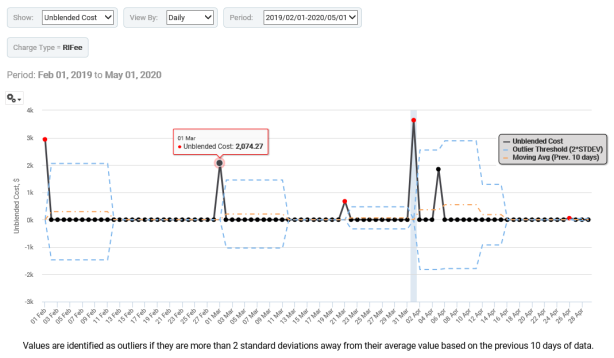
When reviewing the report observe the following:
- Normal data points are shown as black dots.
- The red dots are the outliers.
- The grey, shaded area highlights the time period you selected in the tabular view.
- The orange dashed line is the historical moving average, based on the last 10 days of data, or whatever value and unit you have configured.
- The blue dashed line is the 2-standard deviation threshold. In this case, two standard deviations.
- A footnote below the graph indicates the outlier configuration settings.
Configuring the Outlier Report
Three settings are used to configure this report. These settings are accessible from the settings section in the left pane.
Table: Outlier Configuration Settings
|
Setting |
Default |
Description |
|---|---|---|
|
Outlier Threshold (Std Deviations) |
2 |
The number of standard deviations from the average, that the value needs to be before it is identified as an outlier. The default is 2 standard deviations. |
|
Outlier Time Window |
10 |
Values are identified as outliers if they are more than 2 standard deviations from the average value. This value defines the amount of data used to establish the average value. The default is 10. The time unit depends on what has been selected for the report. If the time scale for the report is in days, then 10 days of data is used to determine the average. If the time scale is in months, then 10 months of data is used to determine the average If you do not have the specified number of <time units> of data, then no outliers will be detected, until the required data has been collected and analyzed. For this reason it is very important to verify the time scale on your outlier reports. |
|
Outlier Minimum |
100 |
This is the minimum value to be considered an outlier. Data points below this are considered part of normal, or expected billing activity. As with the time window, the units are based the data selected for your report. |

You can export the content of any of the Cloud Cost reports by clicking the export icon, located on the right side of the page.
You can export the content from both the tabular view and the drilled down details report to see the full set of data. Data can be export to CSV or XLSX formats. Some tabular reports may support PDF format, but not all, due to sizing limitations. Data exported to .XLSX is not paginated.
Charts can only be exported to PDF format. The currently displayed chart type is exported to PDF. See Chart Type Selection for available chart types. Charts can also be exported as .CSV and .XLSX. In this case, you will get the tabular data on which the chart is based.
You may need to scroll horizontally to see the download icon on some Cloud Cost tabular reports due to the amount of data on the screen.
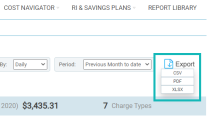
Review and update the file name before saving the file, exports from the same page/report will have the same file name and will overwrite an existing saved report.
Zoom
You can use the zoom features to increase/decrease the report viewing area. The Cloud Cost Intelligence module's zoom features are separate from your browser zoom features.
It is highly recommended that you keep your browser zoom at 100% to avoid display issues and use the zoom feature within the report, as required.
A number of commonly used reports are provided in the Reports drop down menu. The data set is not filtered. The data is grouped as indicated in the report title and there are View By and Period selectors set.
These reports can be customized for your specific use case. You can also adjust the filtering criteria as required and then save your report with a new name.
Click the Save As button at the bottom of the page and enter a unique name and then save your custom-filtered reports for later review.
Filter settings are not persisted between reports, so it is highly recommended that you create and save the settings and reports that you commonly use.
These reports are based on your cloud platform selection in the Cost Navigator menu:
Additional pre-defined options are provided for:
- AWS Reserved Instance—See
- Azure Reservations—See
Table: AWS Pre-Defined Reports for Cost Navigator
|
Report Name |
Description |
Show (Metric) |
Group By |
Period |
|
Costs by Account (Daily - MTD) |
Unblended Costs grouped by Linked Account shown for each day of the previous month. |
Unblended Cost |
Linked Account |
Previous Month-to-Date |
|
Costs by Account (Monthly) |
Unblended Costs grouped by Linked Account showing month over month spend. The last 5 months and month-to-date for the current month are displayed. |
Unblended Cost |
Linked Account |
Previous 6 Months |
|
Costs by Account (Quarterly) |
Unblended Costs grouped by Linked Account showing quarter over quarter spend. The last 4 completed quarters are displayed. |
Unblended Cost |
Linked Account |
Previous 4 Quarters |
|
Costs by Account (Yearly) |
Unblended Costs grouped by Linked Account showing year over year spend. All available data is displayed with year-to-date shown for the current year. |
Unblended Cost |
Linked Account |
Previous 2 Years |
|
Costs by Charge Type (Daily) |
Unblended Costs grouped by Charge Type shown for each day of the previous month. |
Unblended Cost |
Charge Type |
Previous Month to Date |
|
Costs by Charge Type (Monthly) |
Unblended Costs grouped by Charge Type showing month over month spend. The last 5 months and month-to-date for the current month are displayed. |
Unblended Cost |
Charge Type |
Previous 6 Months |
|
Costs by Charge Type (Quarterly) |
Unblended Costs grouped by Charge Type showing quarter over quarter spend. The last 4 completed quarters are displayed. |
Unblended Cost |
Charge Type |
Previous 4 Quarters |
|
Costs by Charge Type (Yearly) |
Unblended Costs grouped by Charge Type showing year over year spend. All available data is displayed with year-to-date shown for the current year. |
Unblended Cost |
Charge Type |
Previous 2 Years |
|
Costs by Service (Daily - MTD) |
Unblended Costs grouped by Service shown for each day of the previous month. |
Unblended Cost |
Service |
Month-to-Date |
|
Costs by Service(Monthly) |
Unblended Costs grouped by Service showing month over month spend. The last 5 months and month-to-date for the current month are displayed. |
Unblended Cost |
Service |
Previous 6 Months |
|
Costs by Service(Quarterly) |
Unblended Costs grouped by Service showing quarter over quarter spend. The last 4 completed quarters are displayed. |
Unblended Cost |
Service |
Previous 4 Quarters |
|
Costs by Service (Yearly) |
Unblended Costs grouped by Service showing year over year spend. All available data is displayed with year-to-date shown for the current year. |
Unblended Cost |
Service |
Previous 2 Years |
Table: Azure Pre-Defined Reports for Cost Navigator
|
Report Name |
Description |
Group By |
View By |
Period |
|
Costs by Subscription (Daily - MTD) |
Costs grouped by subscription shown for each day of the previous month up to the current day of the current month. |
Subscription |
Daily |
Previous Month-to-Date |
|
Costs by Subscription (Monthly) |
Costs grouped by subscription shown for each month of the previous 12 months. |
Subscription |
Monthly |
Previous 12 Months |
|
Costs by Subscription (Quarterly) |
Costs grouped by subscription shown for each quarter for the previous 4 quarters. |
Subscription |
Quarterly |
Previous 4 Quarters |
|
Costs by Subscription (Yearly) |
Costs grouped by subscription showing year to year spend. Available data is displayed for the past two years. |
Subscription |
Yearly |
Previous 2 Years |
|
Costs by Charge Type (Monthly) |
Costs grouped by Charge Type showing month over month spending. The last 6 months are displayed. |
Charge Type |
Monthly |
Previous 12 Months |
|
Costs by Charge Type (Quarterly) |
Costs grouped by Charge Type showing quarterly spending. The last 4 quarters are displayed. |
Charge Type |
Quarterly |
Previous 4 Quarters |
|
Costs by Charge Type (Yearly) |
Unblended Costs grouped by Charge Type showing year over year spending. Available data is displayed for the past two years. |
Charge Type |
Yearly |
Previous 2 Years |
|
Costs by Service (Daily - MTD) |
Costs grouped by Service shown for each day of the previous month up to the current day of the current month. |
Resource Provider |
Daily |
Previous Month-to-Date |
|
Costs by Service(Monthly) |
Costs grouped by Service showing month over month spending. The last 6 months are displayed. |
Resource Provider |
Monthly |
Previous 6 Months |
|
Costs by Service(Quarterly) |
Costs grouped by Service showing quarter over quarter spending. The last 4 completed quarters are displayed. |
Resource Provider |
Quarterly |
Previous 4 Quarters |
|
Costs by Service (Yearly) |
Costs grouped by Service showing year over year spending. Available data is displayed with past 2 years displayed. |
Resource Provider |
Yearly |
Previous 2 Years |
Last Updated: June 2024
|
|
|
|
|
|
|