Summary Tab
Summary Tab
#38xxx
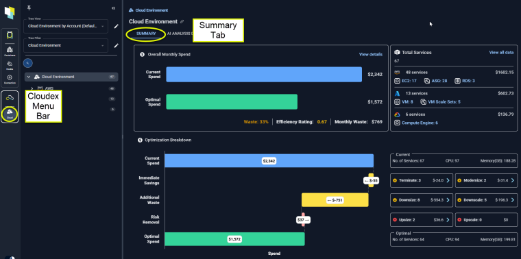
This tab is the landing page for your cloud environments. The charts on this tab allow you to quickly understand the optimization potential in your public cloud environments. Your environment's efficiency and wasted spend are shown in the status bar at the top.
Figure: Locating the Summary Tab
The charts provide a clear breakdown of how optimization recommendations can provide immediate savings, the impact of taking those recommendations to reduce risk in your environment, and what additional waste can be safely removed once you have eliminated the identified risks.
The content on this tab is based on your selection in the tree viewer.
When a single instance is selected in the tree viewer, you will see the Overview and the Catalog Map tabs.
Overall Monthly Spend
This first chart summarizes your current spend and compares this to what you should be spending, based on utilization.
Figure: Overall Monthly Spend
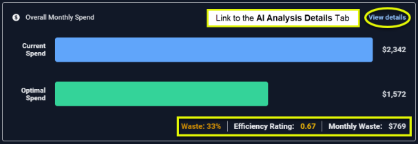
This card provides:
- A link to the AI Analysis Details page, filtered to the selected scope of systems.
- A status bar summarizing possible shortfall or wasted spending.
Efficiency Rating
The Efficiency Rating provides an indication of the health of your aggregated environment.
- A value of 1 indicates that, at an aggregate level, the environment is efficient according to the defined policy settings.
- A value less than 1 indicates potential savings opportunities due to over-allocated resources.
- A value greater than 1 indicates potential risks due to under-allocated resources. The value is indicated in red, when it is greater than 1.
Wasted/Shortfall Spend Estimates
The current and recommended estimated instance costs are used to calculate potential savings or additional spend.
Calculated as: (current estimated cost - recommended estimated cost).
- The total estimated Monthly Waste (as shown in the summary bar) is the sum of the selected instances with positive savings values.
-
The shortfall cost (also in the summary bar) is the sum of all selected instances with negative savings values.
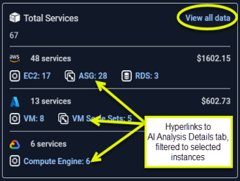
Inventory
This card shows you an inventory of the selected items, broken down by public cloud provider and instance type. Your selection in the tree viewer defines the scope of this report.
The link in the upper corner takes you to the AI Analysis Details page. Links at each level also take you to the detail page, filtered to the specific scope of systems.
Figure: Total Services
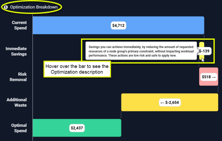
Optimization Breakdown
This bar chart shows the breakdown of your cloud spending:
Figure: Optimization Breakdown
|
Column |
Description |
|---|---|
|
Current Spend |
The bar shows what you are currently spending on the instances, selected in the tree viewer. |
|
Immediate Savings |
Immediate savings can be achieved by optimizing specific instances. A container qualifies for immediate savings if the "% of Nodes with CPU Saturation" is below a predefined threshold. For example, if the threshold is set at 50%, only containers where "% of Nodes with CPU Saturation" is less than 50% should be considered. Immediate savings can be achieved by adjusting the Memory Request settings only for containers within Node Groups where Memory Request" is the primary constraint. Calculated as: Sum of immediate CPU savings + Sum of immediate memory savings |
|
Risk Removal |
Surplus CPU and memory are aggregated for all containers in the selected scope and used to determine this value. Calculated as: Sum(Surplus CPU>0 (in mcores))/1000 mcores/core *CPU unit cost/core + Sum(Surplus mem >0 (in MB))/1024 MB/GB *Memory unit cost/GB |
|
Optimal Cost |
This is what the infrastructure should cost to run the selected workloads. Calculated as ($Total Cost - $Total Estimated Waste). |
|
Additional Waste |
This is possible, additional savings that can be achieved. Calculated as ($Total Cost + Risk Removal - Immediate Savings - Optimal Cost). |
Optimization Breakdown - Details
These cards list the aggregated recommendations for the selected scope of systems, broken down by the same optimization opportunities listed above. These cards provide the details of the recommendations that comprise the total in the corresponding bar chart.
The values are colour-coded to easily identify wasted resources and systems at risk.
Links to the AI Analysis Details page, with the appropriate view applied, are provided so you can investigate the recommendation.
Figure: Optimization Breakdown - Aggregated Recommendations
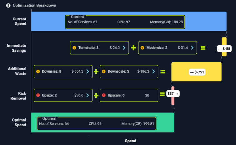
Figure: Optimization Breakdown - Hyperlinks and Status
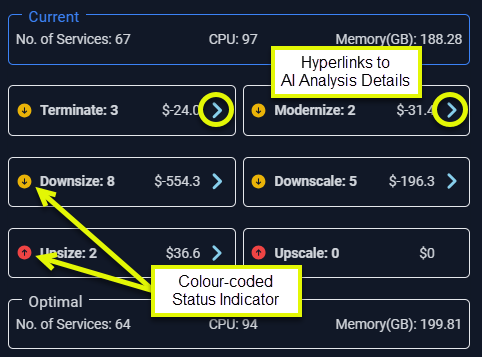
Each card provides a hyperlink that takes you to the AI Analysis Details page, with the relevant view selected.